Alex Frost
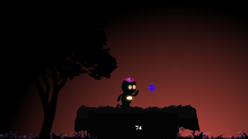
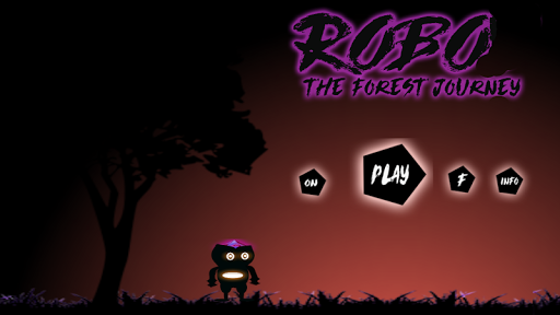
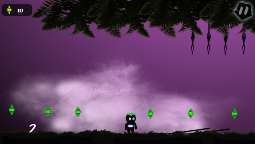
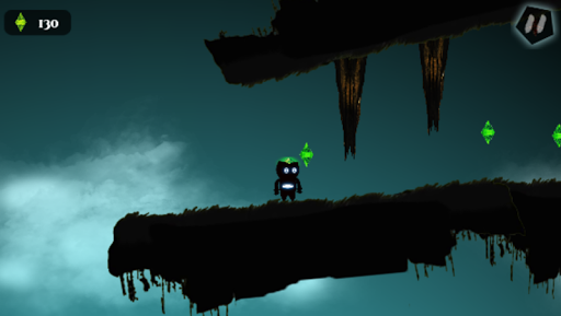
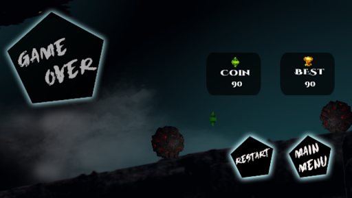
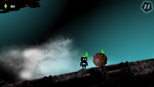
I think this game isn't bad. But it isn't good either. There is definitely potential lying within it but there is poor execution. [Startup] Upon starting the game, there is a screenshot of the player on a platform moving towards a pink crystal, which is beautiful, it gives the player a good understanding of what it is that they are collecting and what kind of game it is. After the splash screen, though, the main menu features a player that looks stretched and squished. Whether this is due to the up or down scaling on my phone I don't know. The main menu buttons are simple and pretty, there is a box formatting issue with the glow around the pentagons, which isn't a huge problem but it seems a little odd. The buttons could also be sized better, the play button is positioned and sized in a way that makes it stand out the most as 'CLICK ME' which is perfectly fine, logically because you want your play button to be the first thing the player notices, but it almost over shadows the rest of the buttons. [Design] I think the artwork is terrific, you really hit the nail on the head! But there are sections where the player is often hidden by the background due to it being a similar colour to the player, making it hard to anticipate your next move. Your animations are lacking, though. When the player is running, it seems that the same 2 frames are played over and over giving it a janky look. It is the same with the jumping animation, it seems to reuse a frame from the running animation, which makes the character look awkward when they jump. I do love the characters idle animation, though, with the orb like glow in the center and the eyes changing shape are brilliant! The obstacle design is terrific too! Honestly, hats off for that one. Everything just looks thought out and polished. That's not to say that there aren't discrepancies though. There is a section after the sine platform over the pitfall that has some grass that looks like it had been stretched out and it gives it this really pixelated effect, which isn't appealing to look at. [Controls] These were the biggest let down for the game, the player just moves way too fast for the user to respond appropriately. With just a light tap, the player is already moving at their top speed, which really puts the player in a tight spot if they are trying to precisely navigate an area. Take the platform over the pitfall for example, it is just way too easy to mess up on that part because the player moves too fast to get on the platform or correct themselves if they overshot it. The player also falls off of platforms way too easily, which has lead to deaths in areas where they aren't needed. [Sound] I really like the ambient noise, the wind rustling is great and fits because the player is in the forest. There's a particular bird that sounds like a seagull which was comical when I heard it, I'll admit. The pickup sound seems to end too abruptly, which makes it seem like it's cut short. Nevertheless, I think this is excellent as a prototype and there is definitely potential in what you have so far. Hats off to you!
2017-09-29 07:25